Have you ever finished writing a blog post and then wondered how you’re going to make a graphic to go with it? I get it. You already know visuals are so important to getting your business noticed, but trying to figure out which image to use and how you want it too look gets frustrating!
You know photos and graphics help make your business stand out and share a little bit more about what’s important, but inventing new ideas with each post is a lot of work. I think we get stuck in overwhelm so easily when we’re the one’s running every part of our business.
It’s so easy to get stuck because you’re not sure where to find great photos. Then once you have beautiful photos, you still need to figure out what to do with them.
Every one of your posts deserves to shine completely on it’s own. Each one deserves to get found by your people so they can share in the awesome value you have.
Great stock images can begin to add the needed loveliness to your posts that you need to stand out ;)
Why Use Stock Photos
Let’s get real honest right here. I think we all spend time looking at other people’s gorgeous brands. You know the ladies who have it all together. The one’s whose site always look fabulous.
One way to try to build a gorgeous brand is to do it yourself but this so often leads to feeling stuck. Another way (and it makes it a lot easier) is by using stock photos.
When you use stock photography on your website it adds a consistent look to your brand. Having a consistent style helps make your brand recognizable.
People will see your work and automatically know who to associate it with! We all want to have some know like and trust factor and stock photography does just that.
The other reason why you want to have some amazing photos on your site is it also makes your brand look more professional. When your photos look like they’re well styled then people automatically assume you’ve got it together.
Brands that have well styled graphics and photos look like they’re a real business. You don’t want to look like your brand isn’t but together.
The last great reason to use stock photos is that using a stock image will help gain that consistency across all the platforms your on. When you’re using the same style images and graphics on every blog post and every social media post then people are going to start to recognize your brand.
The Three Steps
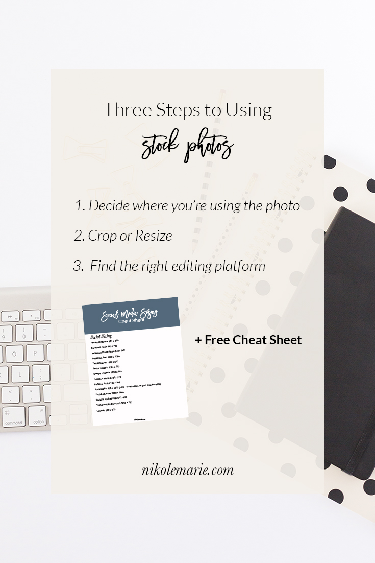
#1 Decide where you’re using it
This one can seem a little basic. I know, but it’s really essential. You need to know exactly how you want to use the photo. It’s like just about everything in business. When you’re clear on what you’re trying to do then you’re able to move forward the right way. It happens kind of the same way with your photos. Every platform has its own particular sizing constraints and when they’re not followed the image can look off! So once you know where you’re going to use it you can figure out the appropriate size and crop for each image.
Knowing where you’re posting will also help you decide how much white space you might need for text overlays or if you want any white space at all. If you decide to crop the photo you’ll know how stylistically decide. (I made a quick cheat sheet to find the correct sizes for social media platforms. Download it now so you don’t have to stress about trying to find it)
Knowing where you’re using the image can also help you decide what images you want to use. Maybe you have a certain feel to your instagram, then you’ll probably want to use the image that fits that vibe. So keep this in mind when you’re choosing.
#2 Crop or Resize
Ok this is where I start to get a little techy. You’re going to want to crop or resize your image to fit the places you’re using it. If you’re using it on your blog it’s not going to be the same size as on your instagram or facebook page. So make sure you’re getting images together ahead of time.
When the sizing of your photo is off then it makes it look distorted on social media. I made a quick cheat sheet with the sizing for major blog graphics and social media. Download it now so you have it to go back to whenever you want! When you have the correct sizing then you know exactly how you’re presenting your brand. It also helps to have all these images and graphics ready right when you post goes live.
The Three Steps to Getting the Most from Stock Photos
#3 Find the Right Editing Platform to Overlay Text
There are some really awesome ways to use stock photos in your business. One of the best ways is to share more such as in a blog post, or social media post. Most times when I do this I put text directly on the image. There are several different tools you can use to do this.
The tool that I use all the time is Photoshop. It has everything I need and complete flexibility of design, which can be amazing! I like it because I can edit photos as well as add graphic elements. It has a 30 day free trial so you could always try it out and then see what else is out there if you don’t love it.
If you don’t necessarily have the skills to tackle that mother of a program than I think Canva is an awesome alternative tool. It’s really intuitive and has great user functionality. The best part is it’s free. There are more capabilities if you choose to get a paid version. I don’t currently use it, but I have tried it in the past.
One more tool (because amazing things travel in threes ;) that could be amazing for tackling your images is picmonkey. I say could be because I haven’t really used it consistently, but I know that it has the ability to add text overlay.
[line]
Want to get the FREE Social Media Sizing Cheat Sheet?
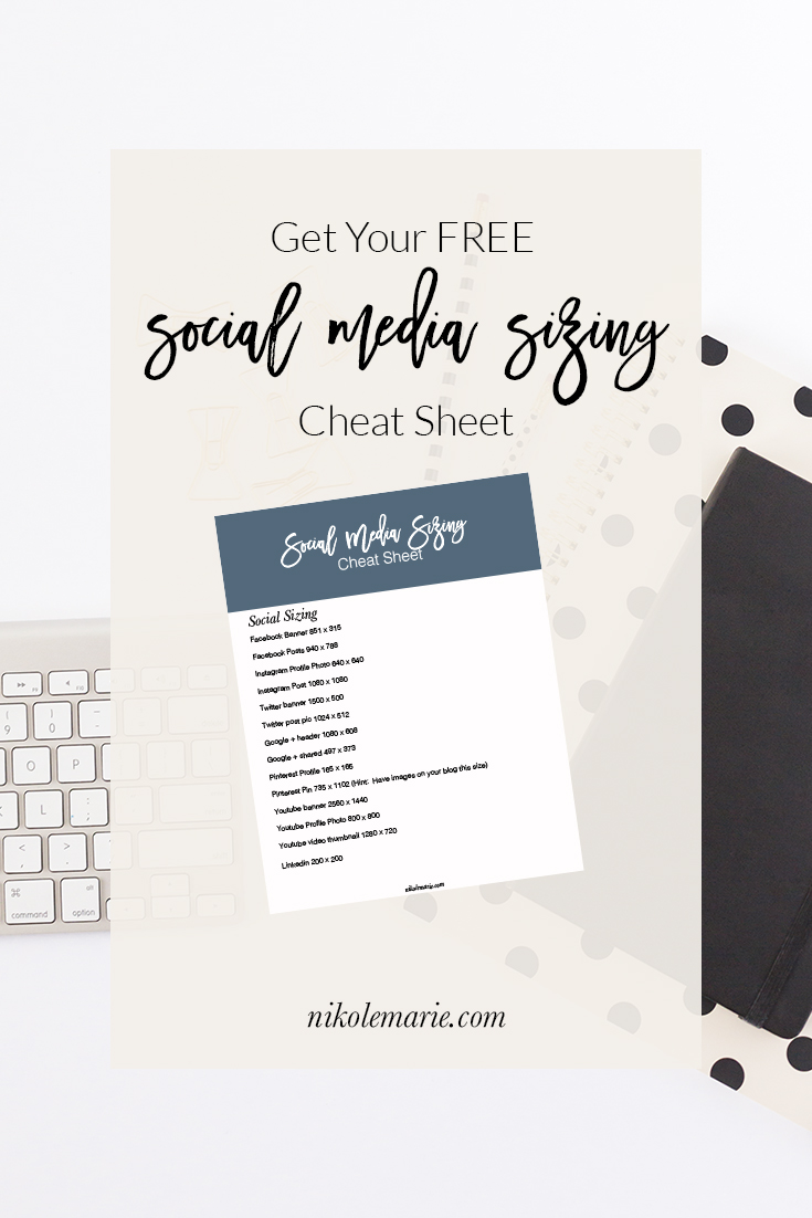
Sweet you’ll no longer need to worry about figuring out what the right size for Instagram, Facebook or whatever is because I’ve got you covered.
The Social Media Sizing Cheat Sheet was made to make it so much easier to figure out what the correct size is for where you’re posting.
No more weird shaped images because they’re not the correct size for the platform you’re on!
I love when things get easier!
